Cet article n’a pas encore d’édition française — vous lisez la version anglaise.
Two of fashion’s biggest trend authorities have now named their colors for the next two seasons, and they landed on opposite ends of the palette. Here’s what’s actually behind both calls, and — more usefully — what an independent brand should do with a color forecast once it has one.
What is Pantone’s Color of the Year for 2026?
Pantone named PANTONE 11-4201 “Cloud Dancer” its Color of the Year for 2026 — the first time in the program’s history it has chosen a white. The announcement came on 4 December 2025. Pantone’s Leatrice Eiseman, Executive Director of the Pantone Color Institute, framed the choice around noise: “The cacophony that surrounds us has become overwhelming, making it harder to hear the voices of our inner selves.” Laurie Pressman, the Institute’s VP, described Cloud Dancer as reflecting “our search for balance between our digital future and our primal need for human connection.”
Read plainly: after several years of maximalist, saturated Colors of the Year, Pantone picked the opposite. That’s a real signal about where the design conversation is, whatever you make of the specific language.
What is WGSN and Coloro’s Colour of the Year for 2027?
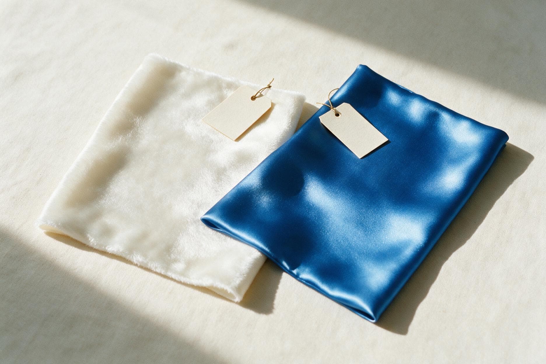
WGSN and Coloro named “Luminous Blue” (Coloro 125-28-38) their Colour of the Year for 2027, alongside four SS27 key colors: Energy Orange, Pop Pink, Meadowland Green and Clay. WGSN describes Luminous Blue as having a “dynamic quality” that is “both mysterious and eccentric, with versatility and broad appeal that will resonate from occasionwear to active.”
Worth noting on timing: this was published 29 April 2025 — for a color tied to the 2027 season. WGSN forecasts run far ahead of the season they describe, which is a genuinely different discipline from Pantone’s. Pantone announces one color each December for the calendar year immediately ahead, aimed at a broad design audience (interiors, product, graphic design, fashion). WGSN and Coloro forecast specifically for the apparel and textile trade, roughly a year to eighteen months before the season ships, because that’s how far ahead of a season a factory actually needs the information.
WGSN’s own prior pick, for context: the 2026 Colour of the Year was Transformative Teal, announced 3 September 2024 — so by the time you read this, WGSN is already forecasting two seasons past the color most stores are currently merchandising around.
Do Pantone and WGSN ever agree, and does it matter which one a brand follows?
They’re not really in competition — they’re forecasting for different audiences on different timelines, and an independent brand doesn’t have to pick a side. Pantone’s pick is a cultural/design signal, useful for marketing language, seasonal campaigns, and packaging — it’s designed to be legible outside fashion. WGSN and Coloro’s forecasts are built for people making sourcing and production decisions a year or more out; they’re more granular (four to five colors per season, not one per year) and more fashion-specific.
For a small brand: Pantone is a marketing hook you can borrow the week it drops. WGSN/Coloro is a production-planning input if you’re already deciding fabric and dye lots a season ahead — not something to chase after the fact.
Does a color forecast actually predict what sells?
Not reliably, on its own — and the same season’s real demand data makes that obvious. The Lyst Index for Q2 2026 shows Chanel, Miu Miu, Dior, Saint Laurent and Gucci as the quarter’s most-searched brands — with Miu Miu searches up 30% quarter-on-quarter and Massimo Dutti demand up 43% in the same period. The single hottest product of the quarter wasn’t a forecast color at all: it was a New York Knicks cap, with search demand up 4,276% quarter-on-quarter — a cultural moment no color forecast published a year in advance could have predicted.
That’s not a knock on forecasting — it’s a reminder of what it’s for. A color forecast tells you what the trade is aligning production around, months to a year ahead. It doesn’t tell you what a cap goes viral for in July.
So what should an independent brand actually do with this?
Treat a named Color of the Year as a marketing and merchandising accent, not a bet-the-collection decision. Use Cloud Dancer or Luminous Blue in campaign language, seasonal capsule pieces, or packaging where the cultural cachet of “this season’s official color” does real work — and keep your core collection built around what your own sales data and something like the Lyst Index actually show moving, not around a forecast alone. The brands that get burned by trend forecasting are usually the ones that over-committed inventory to a single color a year ahead of the season, not the ones that used it as a marketing layer on top of a collection already grounded in demand.
One practical note if you’re testing a forecast color before committing to it: this is exactly the kind of low-stakes decision virtual try-on is built for — seeing whether a color like Luminous Blue actually works before your customer, or you ordering sample yardage, commits to it in person.
FAQ
- What’s the difference between Pantone’s Color of the Year and WGSN/Coloro’s Colour of the Year?
- Pantone announces one color each December for a broad, cross-industry design audience — interiors, graphic design, product, and fashion. WGSN and Coloro forecast specifically for apparel and textile production, publish further ahead of the season (often a year to eighteen months), and name several colors per season rather than one per year.
- Is Luminous Blue already in stores?
- Not yet, and it isn’t meant to be — it was announced in April 2025 as the Colour of the Year for 2027, which is how far ahead apparel production planning typically runs. It’s a forecast for what factories and buyers are working toward now, not a description of current shelves.
- Why does WGSN announce colors so far in advance?
- Because fabric sourcing, dyeing, and production for a fashion season start well over a year before that season reaches stores. A color forecast published close to the season would already be too late for a brand to act on it in production.
- Does trend color actually affect sales, or is it just marketing?
- Both, to different degrees. It genuinely shapes what gets produced at scale, because enough of the industry aligns around the same forecasts. But it’s a weak predictor of what individually goes viral — see the Lyst Index’s Q2 2026 hottest product, a sports cap with 4,276% quarter-on-quarter search growth, which no color forecast anticipated.
- Where can an independent brand see real-time demand data instead of relying only on forecasts?
- Search and marketplace trend trackers like the Lyst Index publish quarterly brand- and product-level search demand, which reflects what’s actually being searched for right now rather than what’s being forecast a year ahead. Use forecasts for planning horizon, and real-time data for what’s currently moving.
Sources. Pantone, “Pantone Announces Color of the Year 2026: Cloud Dancer,” official press release, 4 Dec 2025 · WGSN and Coloro, “WGSN and Coloro Reveal Colour of the Year 2027: Luminous Blue,” official press release, 29 Apr 2025 · WGSN, Colour of the Year 2026 announcement (Transformative Teal), 3 Sep 2024 · The Lyst Index, Q2-26, official report
Last updated 2 September 2026.